Phone Component Infographic
Summary
My final project for GEO 423 (Cartography and Map Design) was to design an infographic on a topic of my choice. I Chose the origins of raw materials for a modern smartphone. The project was completed ahead of schedule and received a 4.0 grade.
My Part
Cartographer
Graphic Designer
Skills Learned + Demonstrated
Stylization of GIS output through Adobe Illustrator
Vector graphic design
Research and implementation of data
Data organization
The Proposal
I wanted to use my infographic to show where all the parts of a modern smartphone come from from the raw materials, not their finished components. For example, the infographic shows that plastics come from Thailand and China, not where the microprocessor is assembled.
Furthermore, the infographic would show how much that material factors into the total cost of the phone and what component that material is used for, such as transistors or microprocessors.
What I Did
I researched the 15 most abundant materials in a smartphone and calculated their cost per ounce. I then generated a column graph in Microsoft Excel that would provide the thickness for each of the flow bands. The bands show two components for each material: cost in relation to the other materials, and where the material comes from. (I hit a snag when gold and silver were much more expensive than the rest of the materials, and normalized the distribution to offset the extreme difference.)
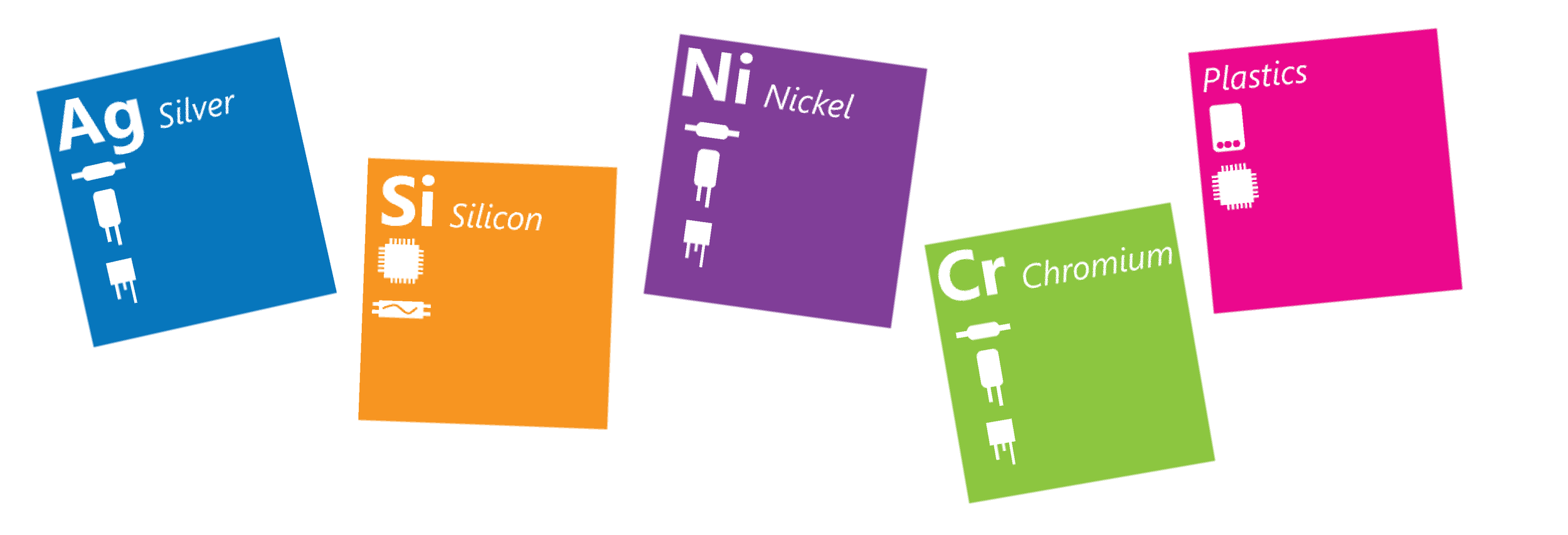
To show the components that the materials were used for, I created a sort of pseudo-periodic table and filled each of the tiles with an icon representing the material.
The Result
I gained knowledge of data organization and processing. The overall flow of the aptly-named flow-map was a learning process full of trial and error. Vector graphic design was refined through the critiques of my peers and through the design process. The resulting poster was quite large when printed, but could be easily readable in a smaller digital PDF format as well.
Click to enlarge.


